Selection and Storage of Distress Inks...
Posted by Rajni Chawla
Gud morning friends!!
This is Rajni Chawla here from Passionately Curious to share a post as a DT for Color Conception on my favorite DISTRESS INKS.
Distress Inks !!Seriously? Who doesn't love these. I can stare and drool at these colors for days.I am crazy for all 41 I have.There is so much fun stuff you can do with them!!!It is almost an year now that I am using Distress Inks.These inks have given a unique look to my quilled creations. My style .....my way of adding themes and backgrounds... all are the results of heavy distressing.
A small introduction to Distress Inks
As you all know these are an amazingly versatile inks developed by Tim Holtz for Ranger Industries. This is a specially formulated water-based dye ink that is acid-free, non-toxic and fade resistant. They do not take on a green or yellow cast when mixed with water as other dye inks do.
Distress ink colors have been chosen for their distinctive vintage flair. These inks are perfect for stamping, achieving the vintage look, photo tinting and countless other techniques. Truly a unique ink, a must have for any stamper.The inks stays wetter for longer- making heat embossing possible with this ink. Also with the ink staying wetter longer makes blending several colors on a background easy. One really cool thing about this ink also is that when you use several colors and blend them on a background then Spitz with water you will see the ink sort of separate and you can see different colors because of the separation- an example could be: purple is a secondary color- make by mixing red and blue- well on some projects if using lavender distress ink when you add the water and the color start to spread a little on the paper and you might see some of it a little more red or blue and maybe a lil pinker in areas. The only way to really understand the uses and love of distress inks is to buy a couple and experiment, also watch some of Tim Holtz's videos. It stays true to its color when added to water when making shimmer sprays.
We have original of 36 shades of Distress Inks besides the 12 new shades.


How to select your first lot of inks..
Like all of u even I had lots of questions.
What color to buy??? What colors to leave ?? and How to use ??
We all some times have limited budget but still get tempted towards our favorite craft supplies.Choosing becomes little difficult at times as our hunger for crafty things never ends.
I am always fascinated with colors and worked with all dark and soft shades. I have done lots of projects in different mediums like oils,water color, acrylic etc and also worked on different base surfaces so I had a little knowledge and experience to handle these which i would love to share with u all today.
I have seen few crafters picking up only basic colors ( blue,yellow,orange,red,green pink). Do we always need the basic BRIGHT shades???
I think ...NO !!
Here I stressed on the word BRIGHT as all basic shades (what generally crafters pick) are really very bold and bright. Instead of picking only basic colors one should pick the family of at least 2 to 3 shades of each color.This is what I myself prefer and guide my students also.....you may choose differently if u want.There is just no rule when we craft.
It is more easier to work with family shades rather than to use contrasts and believe me the results are awesome!! More over as far as distress inks are concerned we can give little brightness to most of all the shades by just adding a touch of Wild Honey.The image looks more brighter or sharper but u can't get lighter tone of the same unless n until u use the actual light color offered by Rangers. Distress inks are transparent inks and we can add as many layers as we want.They easily react with water.


This is Rajni Chawla here from Passionately Curious to share a post as a DT for Color Conception on my favorite DISTRESS INKS.
Distress Inks !!Seriously? Who doesn't love these. I can stare and drool at these colors for days.I am crazy for all 41 I have.There is so much fun stuff you can do with them!!!It is almost an year now that I am using Distress Inks.These inks have given a unique look to my quilled creations. My style .....my way of adding themes and backgrounds... all are the results of heavy distressing.
A small introduction to Distress Inks
As you all know these are an amazingly versatile inks developed by Tim Holtz for Ranger Industries. This is a specially formulated water-based dye ink that is acid-free, non-toxic and fade resistant. They do not take on a green or yellow cast when mixed with water as other dye inks do.
Distress ink colors have been chosen for their distinctive vintage flair. These inks are perfect for stamping, achieving the vintage look, photo tinting and countless other techniques. Truly a unique ink, a must have for any stamper.The inks stays wetter for longer- making heat embossing possible with this ink. Also with the ink staying wetter longer makes blending several colors on a background easy. One really cool thing about this ink also is that when you use several colors and blend them on a background then Spitz with water you will see the ink sort of separate and you can see different colors because of the separation- an example could be: purple is a secondary color- make by mixing red and blue- well on some projects if using lavender distress ink when you add the water and the color start to spread a little on the paper and you might see some of it a little more red or blue and maybe a lil pinker in areas. The only way to really understand the uses and love of distress inks is to buy a couple and experiment, also watch some of Tim Holtz's videos. It stays true to its color when added to water when making shimmer sprays.
We have original of 36 shades of Distress Inks besides the 12 new shades.
How to select your first lot of inks..
Like all of u even I had lots of questions.
What color to buy??? What colors to leave ?? and How to use ??
We all some times have limited budget but still get tempted towards our favorite craft supplies.Choosing becomes little difficult at times as our hunger for crafty things never ends.
I am always fascinated with colors and worked with all dark and soft shades. I have done lots of projects in different mediums like oils,water color, acrylic etc and also worked on different base surfaces so I had a little knowledge and experience to handle these which i would love to share with u all today.
I have seen few crafters picking up only basic colors ( blue,yellow,orange,red,green pink). Do we always need the basic BRIGHT shades???
I think ...NO !!
Here I stressed on the word BRIGHT as all basic shades (what generally crafters pick) are really very bold and bright. Instead of picking only basic colors one should pick the family of at least 2 to 3 shades of each color.This is what I myself prefer and guide my students also.....you may choose differently if u want.There is just no rule when we craft.
It is more easier to work with family shades rather than to use contrasts and believe me the results are awesome!! More over as far as distress inks are concerned we can give little brightness to most of all the shades by just adding a touch of Wild Honey.The image looks more brighter or sharper but u can't get lighter tone of the same unless n until u use the actual light color offered by Rangers. Distress inks are transparent inks and we can add as many layers as we want.They easily react with water.
How to choose the family Shades
I have inked & stamped a bunch of tags using these inks (old and new shades) and selected 2 or 3 shades to make one family that I choose, just to show u how varied the colors are.This will help u choose the ones u want to add to ur craft room too.
Here we goooooo.....
I have selected three shades and made one family which i call MUST HAVE FAMILY.These includes Vintage Photo,Walnut Stain and Black Soot. With Vintage Photo, u can give an aged look to any color.With walnut stain and Black soot u can define it more properly.I have posted few examples to show how they can create wonders to your projects.
FAMILY OF BROWNS AND BLACK

Must have family

FAMILY OF REDS AND PINKS
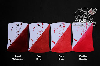

Selected family of reds and pinks


Hope you all liked my super lengthy post.The whole information I shared is based on my own personal experience.Please rectify me if I'm wrong anywhere.
Following are the shades of reds n pinks available. I have combined 1 red and 2 pinks to make one family.Fired Brick (yes, believe it or not a red must have color LOL!!),Picked Raspberry and Worn Lipstick.


Selected family of reds and pinks

FAMILY OF BLUES
Oh....love love all the colors!!! I should here add Stormy Sky also.....but to me it looks more of grey. That"s why added it to grey family.Selected only three....Peacock Feathers,Chipped Sapphire, (OMG ~ simply awesome color of blue) and Salty Ocean. Earlier when i was not having Salty Ocean i preferred Broken China.

Selected family of blues

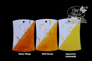
FAMILY OF YELLOW AND ORANGE
I have selected Rusty Hinge,Wild Honey (Oh....i'm crazy for this color) and Squeezed Lemonade in this family.Again here Squeezed Lemonade is the new addition to my collection,Earlier i preferred Mustard Seed.


Selected family of orange and yellows

Selected family of greens

Selected family of purples


Selected family of grey

1. Browns N blacks : Vintage photo,Walnut Stain and Black Soot
2. Reds N pinks : Fired Brick Picked Raspberry and Worn Lipstick.
Just look at the awesome effects of distress inks i have created.So versatile and so much fun!! In the first set i took Picked Raspberry as the main shade and in second one i took Chipped Sapphire.


And here is what i came up with just simple techniques of distress inks.....again money envelops!!!
Hope you like them.


WUD LOVE TO SHARE HOW I STORE MY DISTRESS INK PADS ???
I have 41 ink pads....all of my choice.I labeled them all with inked strips on all the four sides,named them with black markers and stacked on Distress Display Rack.I have few double ink pads. I always try to keep myself packed with extra stock which i need in quantity.


Selected family of blues

FAMILY OF YELLOW AND ORANGE
I have selected Rusty Hinge,Wild Honey (Oh....i'm crazy for this color) and Squeezed Lemonade in this family.Again here Squeezed Lemonade is the new addition to my collection,Earlier i preferred Mustard Seed.


Selected family of orange and yellows

FAMILY OF GREENS
There are three new and three old shades out of which i selected
Crushed Olive,Pealed Paint and Mowed Lawn.

Selected family of greens

FAMILY OF PURPLES
we also get Seedless Preserves which is smokey deep purple along with other three existing flavors of Shaded Lilac,Mild Lavender and Dusty Concord. Mild Lavender and Dusty Concord are the best I guess. I think each color can be used for variety of images.

we also get Seedless Preserves which is smokey deep purple along with other three existing flavors of Shaded Lilac,Mild Lavender and Dusty Concord. Mild Lavender and Dusty Concord are the best I guess. I think each color can be used for variety of images.

Selected family of purples

FAMILY OF GREYS
This family includes soft smokey colors with grey hues. The selected ones colors are Old Paper & Weathered Wood.

Selected family of grey

NOW HERE IS THE COMPLETE LIST OF MUST HAVE FAMILY SHADES
1. Browns N blacks : Vintage photo,Walnut Stain and Black Soot
2. Reds N pinks : Fired Brick Picked Raspberry and Worn Lipstick.
3. Blues : Peacock Feathers,Chipped Sapphire and Salty Ocean/Broken China
4. Yellows N orange : Rusty Hinge,Wild Honey and Squeezed Lemonade/ Mustard Seed
5. Greens : Crushed Olive,Pealed Paint and Mowed Lawn.
6. purples : Mild Lavender and Dusty Concord
7, Grey : Old Paper & Weathered Wood.
4. Yellows N orange : Rusty Hinge,Wild Honey and Squeezed Lemonade/ Mustard Seed
5. Greens : Crushed Olive,Pealed Paint and Mowed Lawn.
6. purples : Mild Lavender and Dusty Concord
7, Grey : Old Paper & Weathered Wood.
Just look at the awesome effects of distress inks i have created.So versatile and so much fun!! In the first set i took Picked Raspberry as the main shade and in second one i took Chipped Sapphire.


And here is what i came up with just simple techniques of distress inks.....again money envelops!!!
Hope you like them.
I have 41 ink pads....all of my choice.I labeled them all with inked strips on all the four sides,named them with black markers and stacked on Distress Display Rack.I have few double ink pads. I always try to keep myself packed with extra stock which i need in quantity.

Hope you all liked my super lengthy post.The whole information I shared is based on my own personal experience.Please rectify me if I'm wrong anywhere.
Now coming to the best part...THE CRAFT SHOP hoards the entire range of Distress Inks. All 48 shades are available at very reasonable prices.The complete range of tools required for distressing...like blending tool , blending foam and nonstick mat is also available.
So hurry and book your orders now.
For any queries on this.....comment below.
Do leave some love if u find my post useful...Thanks :)
Have a nice inky weekend.......:)
Rajni
So hurry and book your orders now.
For any queries on this.....comment below.
Do leave some love if u find my post useful...Thanks :)
Have a nice inky weekend.......:)
Rajni


